While redesigning Myrspoven’s customer app, we cut “AI vs. Baseline,” a graph-heavy diagnostic tool, from the MVP to focus on other priorities, thinking its core functions had been covered elsewhere. But in early user testing, it became obvious the app couldn’t function without it. By rethinking the tool’s design, and later extending its patterns to other parts of the product, we turned it into the app’s most valued feature.

Myrspoven is a pioneer in AI-driven building optimization. Their core product uses an AI model to optimize a building’s HVAC system every 15 minutes, finding a balance between indoor comfort and energy savings. Users set min/max values to guide the AI’s output.
Of course, no AI is perfect, especially right out of the box. Plus, buildings are complex, with multiple overlapping control systems and unpredictable human factors. Multiple control systems, unpredictable human behavior, and the occasional “tenant opened the window in January” moment mean human oversight is essential.
My task was to design a new customer-facing portal that would:
While testing our initial MVP with internal users, I gave them two tasks, and asked them to use the new portal to solve them as much as possible:
In both cases, users had to leave the new app and use the old “AI vs. Baseline” tool to finish.
In both cases, users had to leave the new app and use the old “AI vs. Baseline” tool to finish.
Key insight: The new “happy path” laid out in the spec was a road to nowhere. Without some form of this tool in the MVP, technicians couldn’t do their jobs.
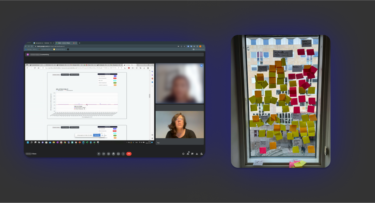
Left: A user demonstrates the old AI vs. Baseline interface during internal user testing.
Right: Post-its with sorted insights and tasks generated from testing are affinity mapped and prioritized
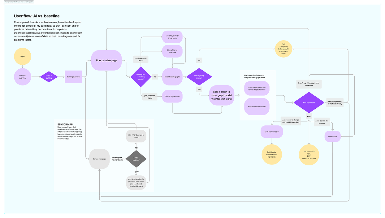
In diagnostic workflows, users often knew which signals they needed to analyze, but had trouble finding them in the endless scroll, often resorting to ctrl+F.
Solution: Added search, chip filters, and date picker to the top of the interface, helping users to tailor the view to their current needs

Repeated interface elements, slow loading, and layout made it challenging for users to scan quickly. This was important to both workflows, but especially for the daily checkup.Solution:
Solution:
Supplemental data was hidden and tedious to access. All supplemental data was also presented on a single graph despite different units and scales, leading to a difficult-to-interpret graph with effectively 3 different y-axes.
Solution:
.png)
A paradox came up in conversations with stakeholders and management-level users. We wanted users to proactively manage their buildings, but too much “tinkering” with the wrong values — specifically, those displayed in AI vs. baseline — would make the AI less effective, validating technician users’ distrust in the system.
Solution:
I added a bit of friction back in. Values could be viewed in the graph modal, but not directly edited there. Instead, users could click through to edit the values in a different view and context, giving more time to consider if a change was helpful.
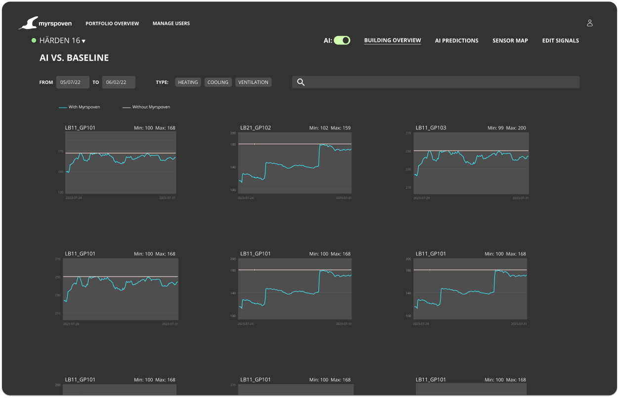
As a designer and a journalism junkie, I’ve always enjoyed a good data visualization, but working on this project heightened my awareness of data visualization patterns even further. I had recently bookmarked a news story that showed a grid of scatter plots with the thought of using it for another app feature, but I realized it was also the perfect solution for AI vs. baseline. Such a presentation, called "small multiples," lets users compare trends and find patterns across multiple similarly-scaled datasets by presenting smaller graphs in a grid.
Given our tight timeline and past struggles to get useful feedback from this test group based solely on wireframes, I knew I had to move fast to create fairly high-fidelity prototypes. Luckily, I already had the components library and design system I’d created for the redesign project, along with some well-established workflows for bringing real graphs from the old app into Figma. I mocked up two versions of the interface: one with the old single-column layout and another using the small multiples pattern, where users could “drill down” into a graph that interested them.
As we began planning for launch, another wrinkle emerged. After months of development, it turned out that a key AI-driven feature — the one that took center stage in all the decks being shown to investors — simply wasn’t technically feasible as planned. In bleeding-edge AI products, these things happen, but this left a big gap in perceived product value.
I was able to make the case that, thanks to the new AI vs. baseline, we were delivering more than enough value to users by improving the presentation of the data they really used. This would help users to gradually trust and understand the AI over time as they measured its impact in the data views and language they were already familiar with.
Based on this insight, I began improving and extending other key, but neglected, data features, often using the design patterns from AI vs. baseline. By leaning on meeting user needs instead of delivering flashy features, we were able to deliver a product with measurable value to end-users at launch.
Design win: Reusing design patterns and applying research insights to other features helped us build a rich, user-centered product even without the missing feature.
.png)
I planned pre-launch usability testing and prepared a plan to monitor if the app was meeting our goals by tracking metrics over time:

